
The term advanced visualization often means the use of technology to capture multivariable datasets. In this chapter, advanced visualization will refer to advanced statistics. In order to generate visualizations using R, we will use a package called ggplot2.
ggplot2
ggplot2 is a visualization plotting package for R. It provides a powerful model of graphics that makes it easy to produce complex multilayered graphics. The underlying plan of the creator of ggplot2, Hadley Wickham, was based on the idea that the grammar of graphics can be applied to better design visualization.
Wickham (2009) outlines the use of grammar in graphics as the foundation of his visualization package. His foundation was based on Leland Wilkinson’s (2005) attempt to establish grammar in graphics and visualization. The grammar as implemented by the ggplot2 package exploits the low-level and high-level graphical object controls intrinsic to R while using a simplified code syntax. The foundation of ggplot2 consists of several functions that must be present in the code to ensure success in producing the visualization with ggplot2.
To install the ggplot2 package, use the following code:
>install.packages(“ggplot2”)
>library(ggplot2)
The most important concept of ggplot2 is that graphics are built based on different layers. This includes anything from the data used, the coordinate system, the axis labels, to the plot’s title. What makes ggplot2 so unique is the layered grammar that is included in ggplot2. It allows us to build complex graphics by adding more and more layers to the basic graphics while each layer is simple enough to construct. Layers can contain one or more components such as data and aesthetic mapping, geometries, statistics, or scaling.
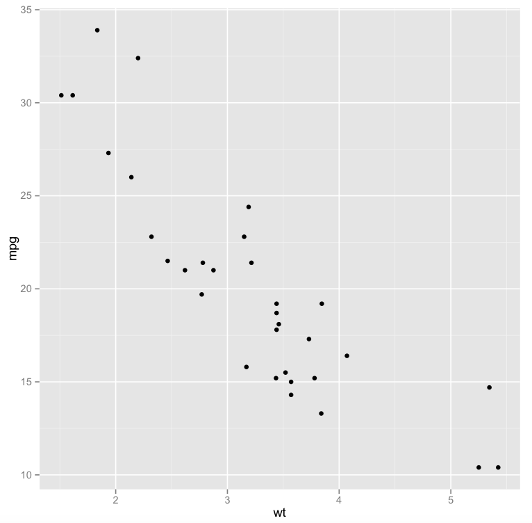
Let’s start with an example using layers:
The code in R:
>library(ggplot2)
>data(mtcars)
>p <- qplot(wt, mpg, data = mtcars)
>p + geom_abline()
The first line activates ggplot2. The second line loads the mtcars file which is where the data is located. The third line creates a data.frame where p is the header. Line 3 of the code outlines the plot where the two variables being used are wt and mpg. You also need to state where the data is located. In the fourth line, the code creates a layer for the geom_abline (line for the plot) to generate this line graph. The geom_abline() is used to create scatterplots. A geom draws a point defined by x and y coordinates. The last line provides more details for the graphic outline in this visualization.
Review of the data in the code:
The data set for this graph is called mtcars. The data frame has 32 observations on 11 variables. The 11 variables include:
| [, 1] | mpg | Miles/(US) gallon |
| [, 2] | cyl | Number of cylinders |
| [, 3] | disp | Displacement (cu.in.) |
| [, 4] | hp | Gross horsepower |
| [, 5] | drat | Rear axle ratio |
| [, 6] | wt | Weight (lb/1000) |
| [, 7] | qsec | 1/4 mile time |
| [, 8] | vs | V/S |
| [, 9] | am | Transmission (0 = automatic, 1 = manual) |
| [,10] | gear | Number of forward gears |
| [,11] | carb | Number of carburetors |
The layers in ggplot2 also consist of parameters. The general outline of these parameters include:
x – (required) x coordinate of the point
y – (required) y coordinate of the point
size – (default: 0.5) diameter of the point
shape – (default: 16=dot) the shape of the point
colour – (default: “black”) the color of the point
fill – (default: NA) the fill of the point
alpha – (default: 1=opaque) the transparency of the point
na.rm – (default: FALSE) silently remove points with NA coordinates
The result:
Visualization of multivariate analysis
Multivariate data consists of the analysis of many variables, numbering from a minimum of six variables to millions. Such data usually includes control variables (factors) and/or characteristics (responses). In order to visualize a dataset that consists of more than five rows of variables, we employ a package called diamonds, also part of the ggplot2 set. The dataset contains the prices and other attributes of 54,000 diamonds.
This dataset is part of the ggplot2 package. The code in R:
>library(ggplot2)
>data(diamonds)
To review the context of the dataset:
> diamonds
The diamonds dataset consist of the following variables:
-price in US dollars (\$326–\$18,823)
-carat. weight of the diamond (0.2–5.01
-cut. quality of the cut (Fair, Good, Very Good, Premium, Ideal
-colour. diamond colour, from J (worst) to D (best)
-clarity. a measurement of how clear the diamond is (I1 (worst), SI1, SI2, VS1, VS2, VVS1, VVS2, IF (best)
-x. length in mm (0–10.74)
-y. width in mm (0–58.9)
-z. depth in mm (0–31.8)
-depth. total depth percentage = z / mean(x, y) = 2 * z / (x + y) (43–79)
-table. width of top of diamond relative to widest point (43–95)
For this example, we will use a 2D rectangular bin to visualize this data:
>d <- ggplot(diamonds, aes(carat, depth, z = value))
>d + stat_summary2d()
The result:
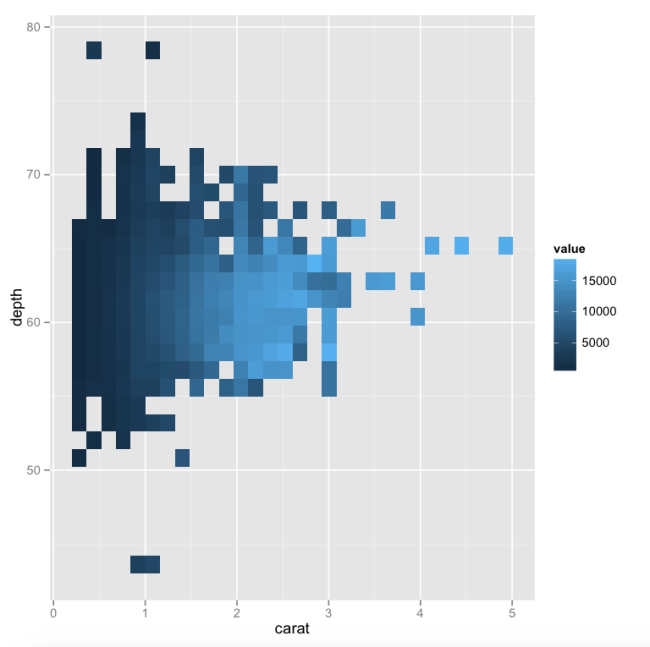
We define the variables we use for our analysis in the first line. In the second line we use the command stat_summary2d() that the data is decided by x, y and z.
The biggest advantage of ggplot2 is its ability to create additional layers to produce 2D and 3D dimensions in the visualization.
Next, Chapter 17, Applying Visualization to Statistics Analysis
Previous, Chapter 15, Visualization Display